Colorful, Two-Tone Trim: 5 Ways to Get the Look
In last month’s blog post about bathroom renovations, I confessed my love for beautiful woodwork (trim, wainscoting, crown moulding)… and I confessed my love for color. As if it could get any better, I’m now sharing the happy marriage between both… the two-tone look!
Now, you’ve probably seen this style all over House Beautiful, Architectural Digest, Luxe (and Pinterest, of course) because it’s pretty darn classy and incredibly versatile.
source
Today I’m sharing 5 of my favorite ways to nail this look. But first, let’s address the elephant in the room...
Why Does Two-Tone Trim & Wainscoting Look So Darn Good?
There are a lot of ways to do the two-tone look, and while you might like more than others, there’s no denying that they all have a certain extra something to them. So what is it?
Instant Elegance (& Added Home Value)
As wood work that is physically connected to your home, trim and wainscoting instantly add classic elegance and timelessness — whether it’s a full-on traditional style or more sleek and modern.
Our eyes must know what’s up, because these elements also add to your property value!
Contrast & Drama that Interests the Eye
There’s no arguing it — the two-tone look catches the eye. The contrasting colors immediately grab our attention, and the more contrast, the more drama!
A Pop of Color sans Commitment
The two-tone look can also add subtle color to a space (especially since white spaces are all over the place these days) without a full-blown color commitment. Better yet, they’re easily updated. Give the trim or wainscoting a new shade in 5 years, and it will be like you moved into a new home.
5 Ways Designers Have Nailed the Two-Tone Look
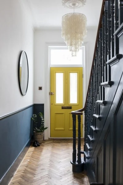
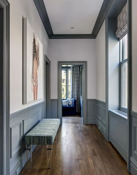
Two-Tones: Wainscoting and Staircase vs. Walls
A moody staircase that greets you right when you walk in the door? Yes, please! I also love (love, love) the natural wood of the stairs in the photo on the left and the herringbone flooring on the right. These are both beautiful, natural accents that keep each space from looking artificial.
Two-Tones: Door, Trim and Cabinets vs. Walls
An understated version of the two-tone look, these bathrooms boast slim, effortless trim, and matching cabinets and door. You can also see the difference in the vibes created by the bold, moody green and the softer periwinkle. As I mentioned, perfect for white spaces!
Two-Tones: Trim vs. Walls
Ooooh, DRAMA! The dark vs. light theme in both of these catches the eye big time. I also love how the designers paired furnishings that very nearly match the accent colors. This helps keep the space looking harmonious.
Two-Tones: Crown Moulding, Trim and Wainscoting vs. Walls
Two versions: colorful accents OR colorful walls. I love how these are similar strategies and both look like a million bucks, but they’re also very different!
Two Tones: Wainscoting vs. Walls
And the last and simplest of them all: walls vs. wainscotting. The dark color helps the bathroom recede, making it look larger. Plus, the pop of color is both relaxing and fun!
So, are you convinced? If you’re practically screaming, “Give me more, Susie!” — I got you. You can find more on my Pinterest board here.
Or, if you’re itching to for a designer to transform your space (and how you live in it), we can do for you that, too. I’d love for you to contact us here.
Until next time,
Susie


